NestEgg has launched a new feature: open banking affordability charts.
The cost-of-living crisis is developing into a recession. Of course, this isn’t good news for responsible lenders. Because of this, it’s more important than ever to navigate data so those that are struggling are spotted early on.
One of the advantages of NestEgg’s decision engine is that open banking information is displayed alongside credit data in one place. To support affordability assessment, two new charts have been released:
- Disposable income over time
- Breakdown of income over time
Disposable income over time
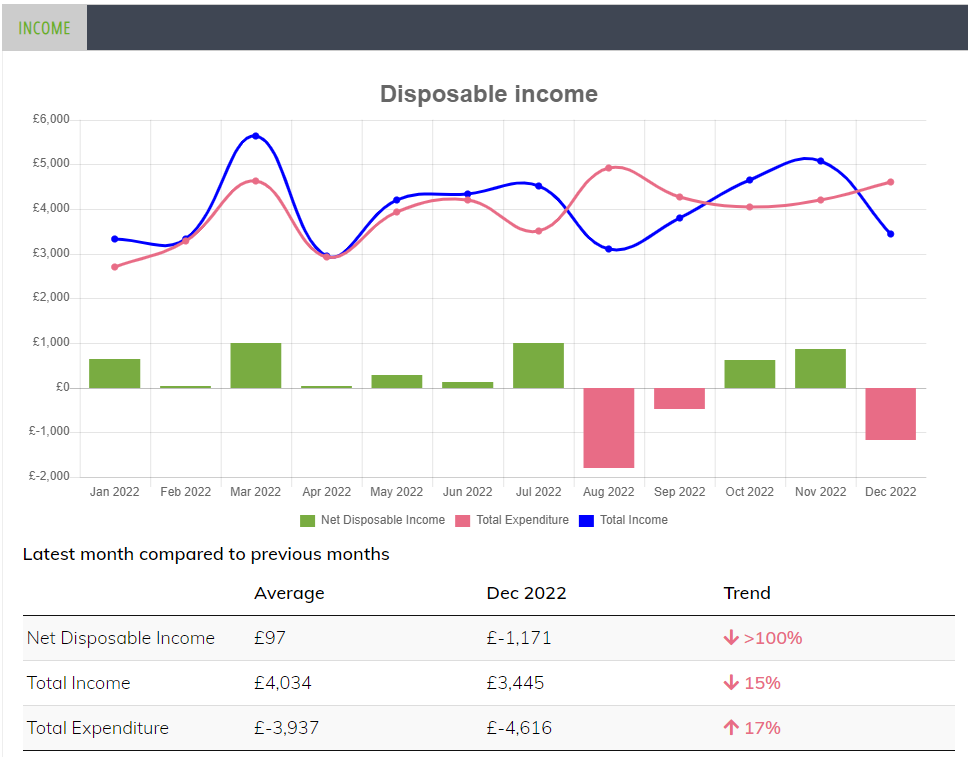
This chart shows income and expenditure over the period of the connection and calculates the disposable income month by month. Additionally this is compared to the most recent month.
As a result, Loans Officers are able to view changes to disposable income over time and note any recent positive or negative changes.
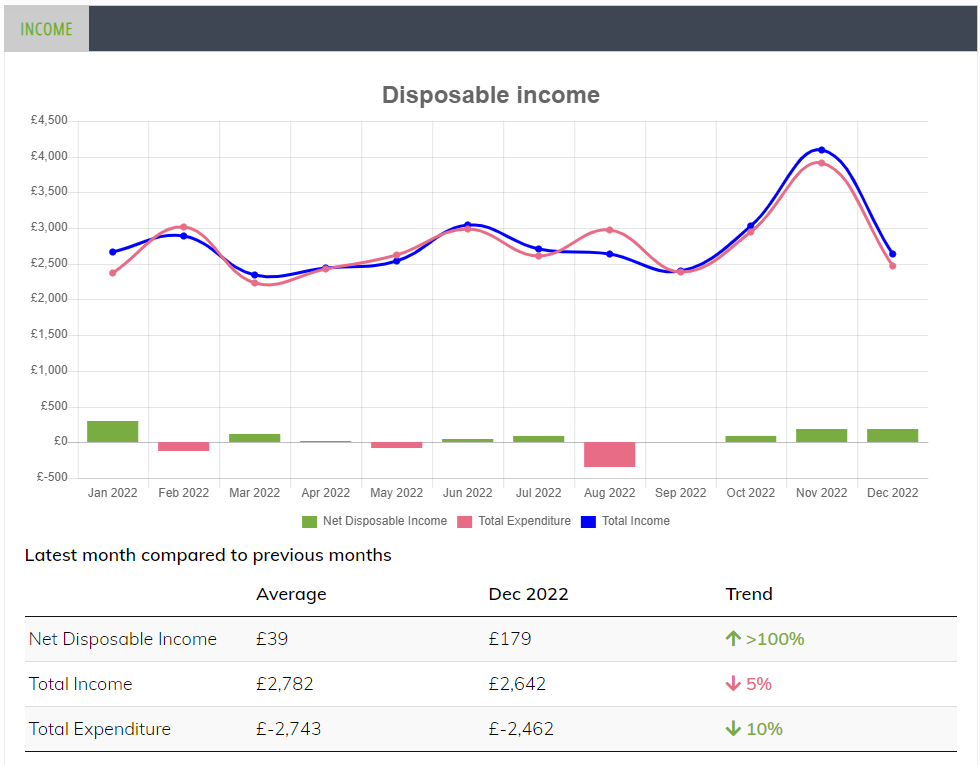
Disposable income: identifying trends
In the example below, the trend arrow for expenditure has been consistent, but income has fallen in the last month having a significant impact on disposable income:
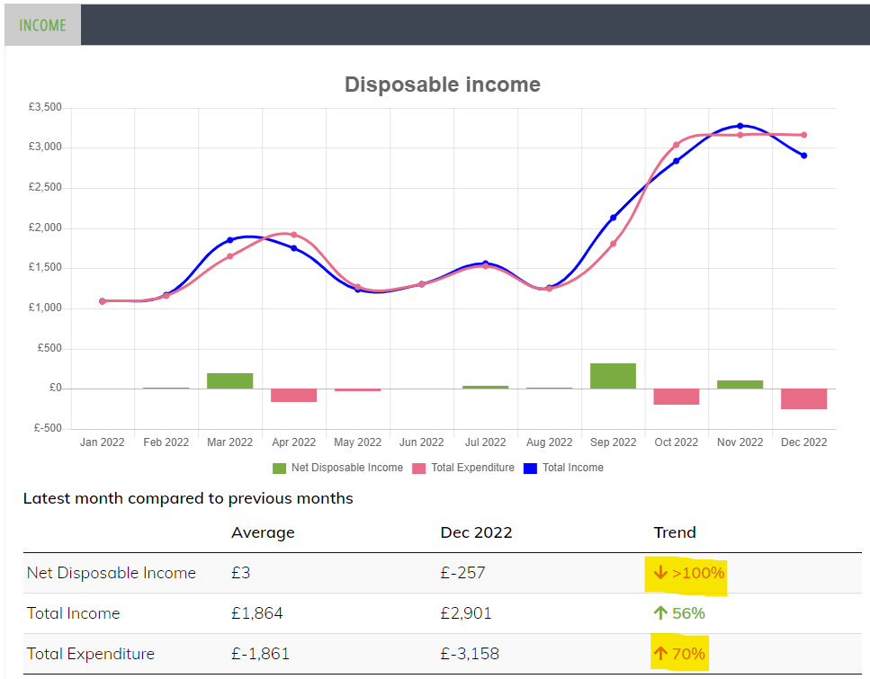
Often the picture is mixed. In the example below income is up 56%. However, expenditure is up 70%. Consequently, net disposable income has fallen by over 100%:
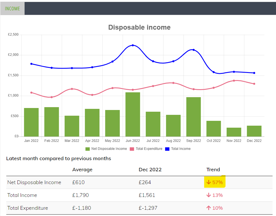
In this example the disposable income is consistently high. However, in the most recent month it has fallen:
Breakdown of income over time
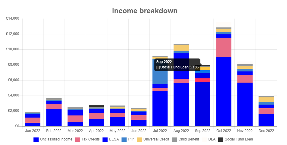
This chart shows income over the period of the connection. In a stacked bar chart it shows the different components of income. The average over the connection is compared to the most recent month.
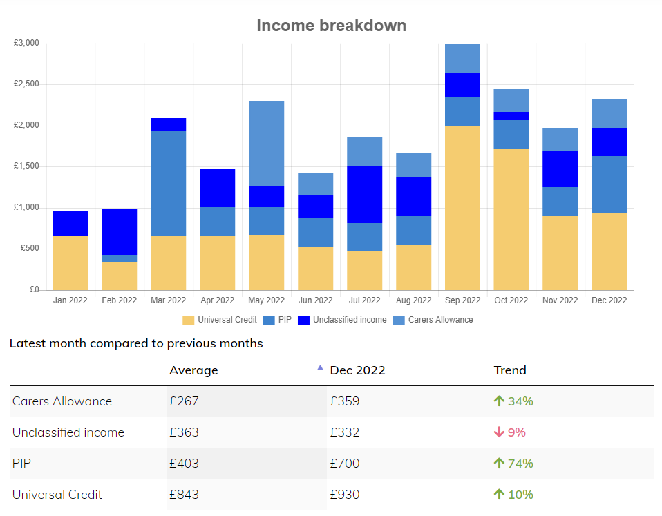
Income from benefits can be complex. In this chart several different types of benefit are being received, but note the social fund loan:
More on the way
Book a demo now
Get insights into responsible lending
Enter your email to get insights once or twice a month
No spam. Unsubscribe anytime.
